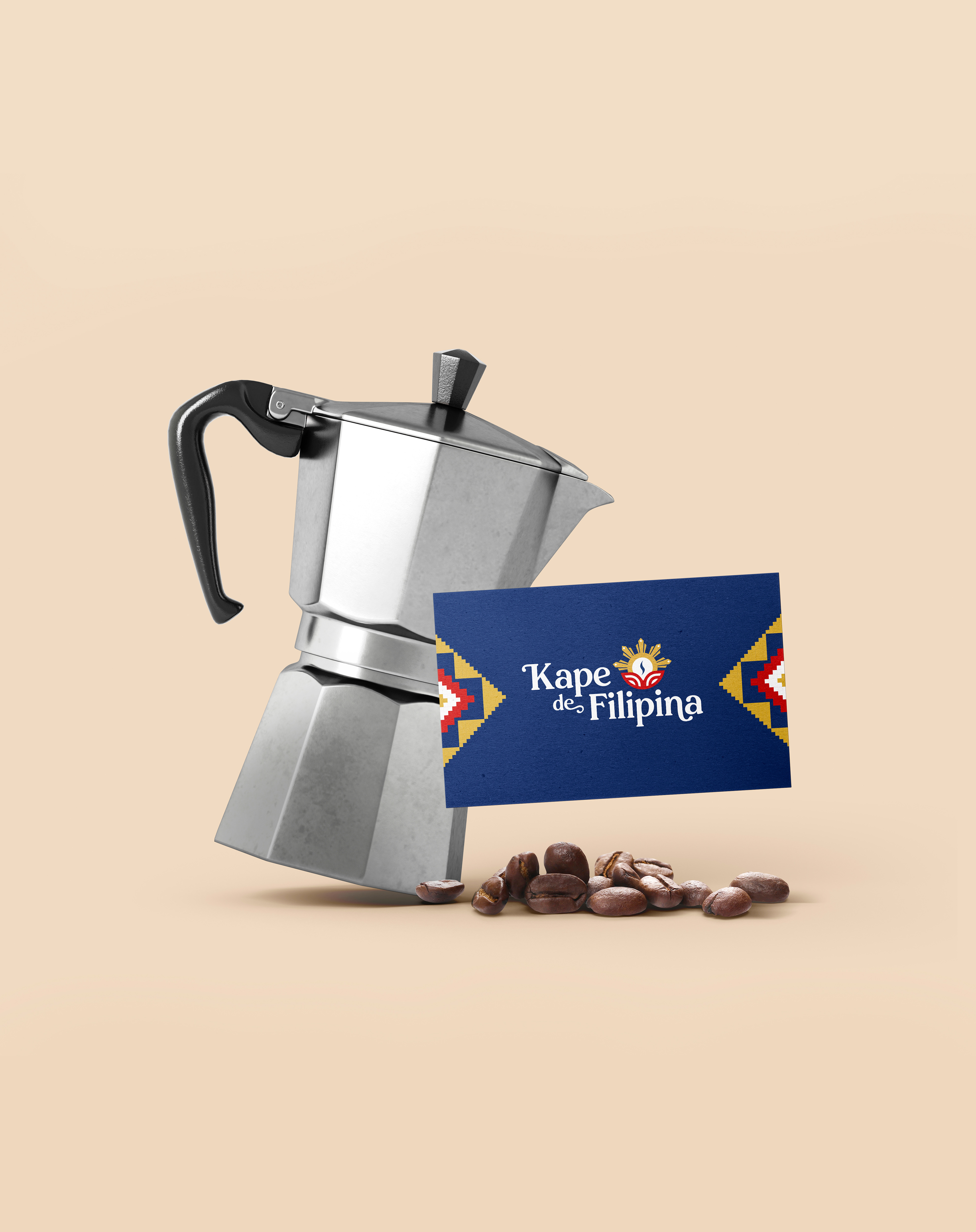
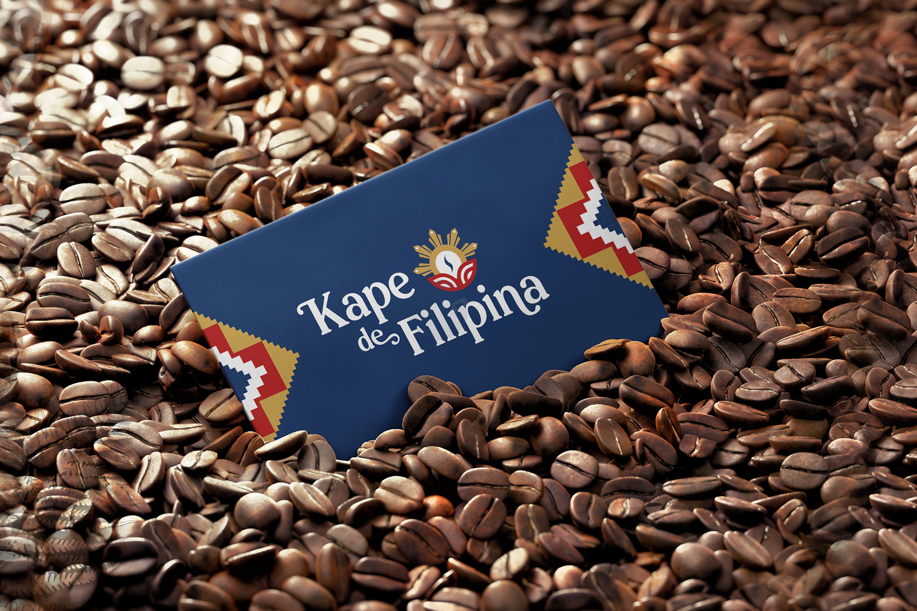
Kape de Filipina: Experience the Philippines
Kape de Filipina is a coffee brand based in Berlin, Germany that aims to bring the Philippines back to the global coffee map. They want people around the world to recognize the Philippines' potential to be a major force in the global coffee industry, as it once was. Their ultimate goal is for their audience to have the full Filipino coffee experience, which includes learning about and appreciating the rich diversity the Philippine coffee brings to the industry, its unique flavours, and the communities behind Filipino coffee.
WHAT WE DID
• Brand Identity Design
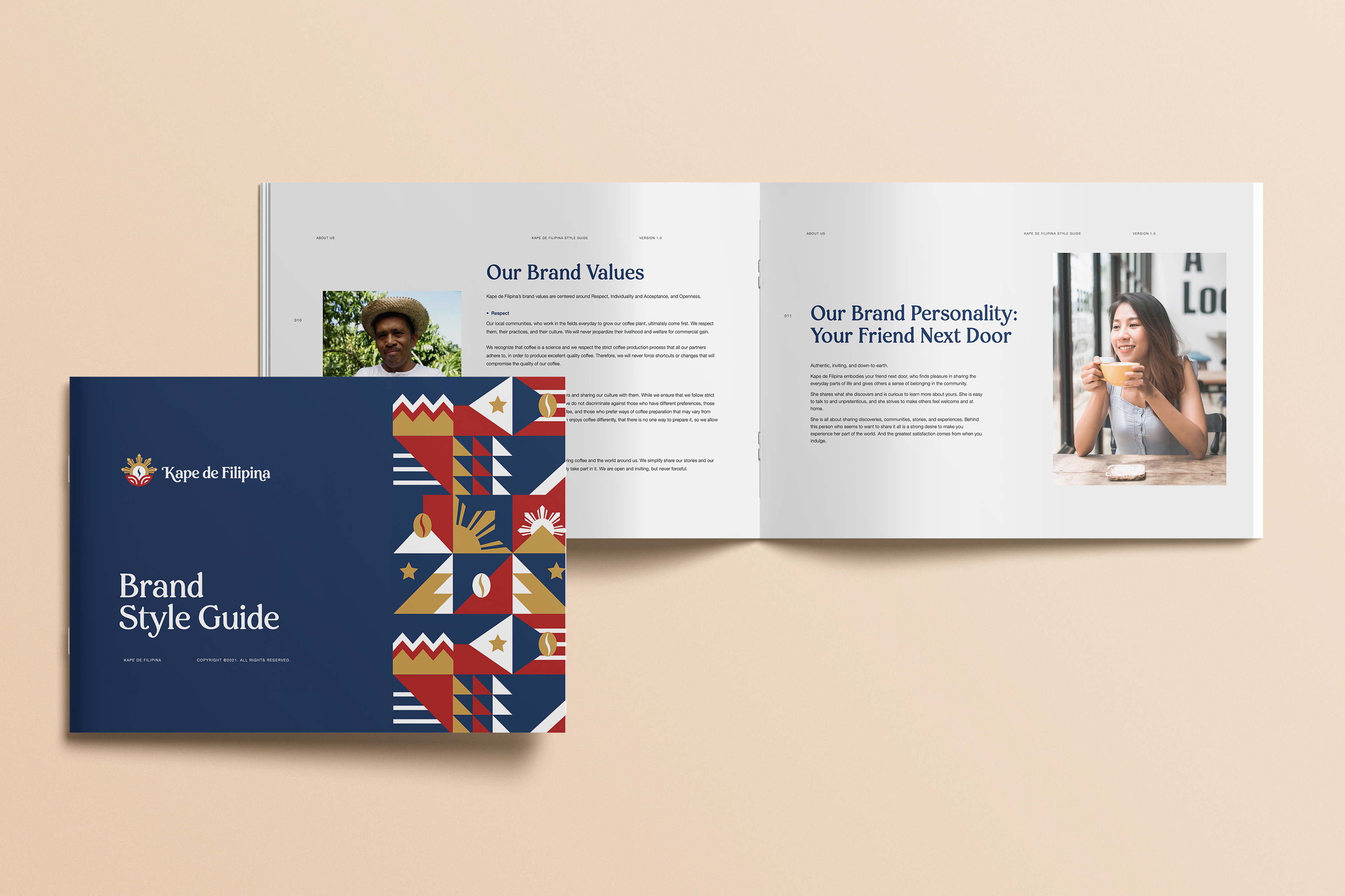
• Brand Style Guide
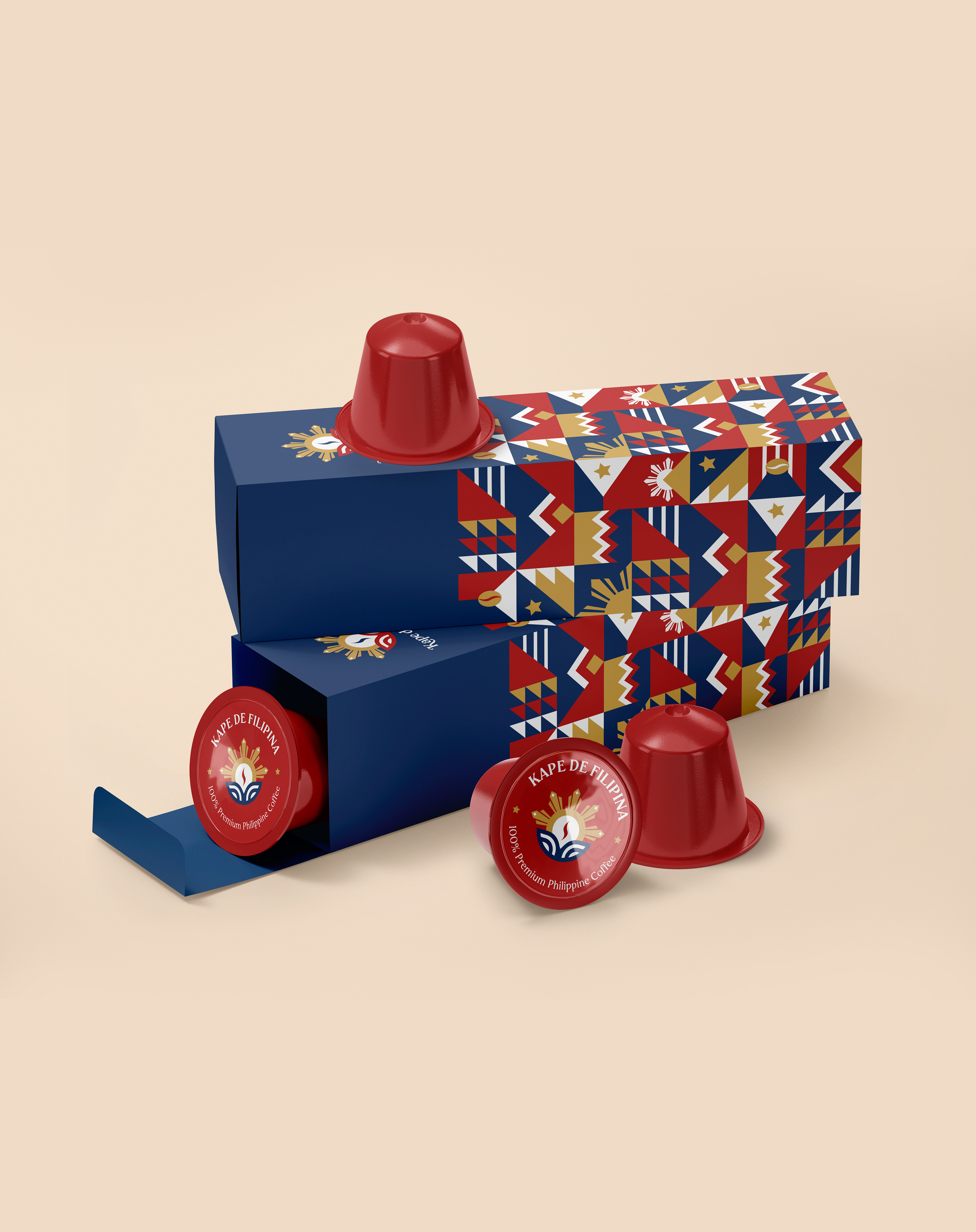
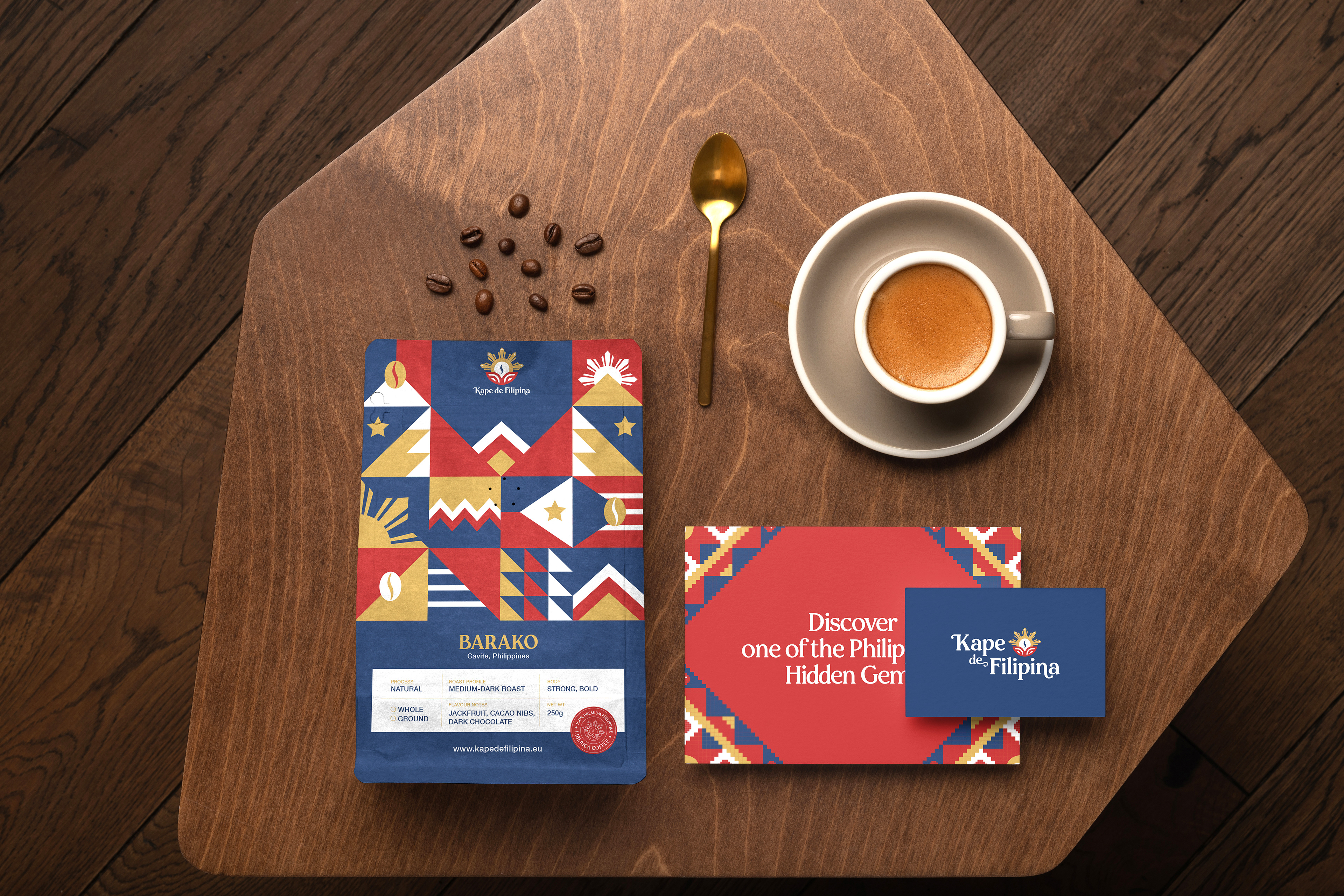
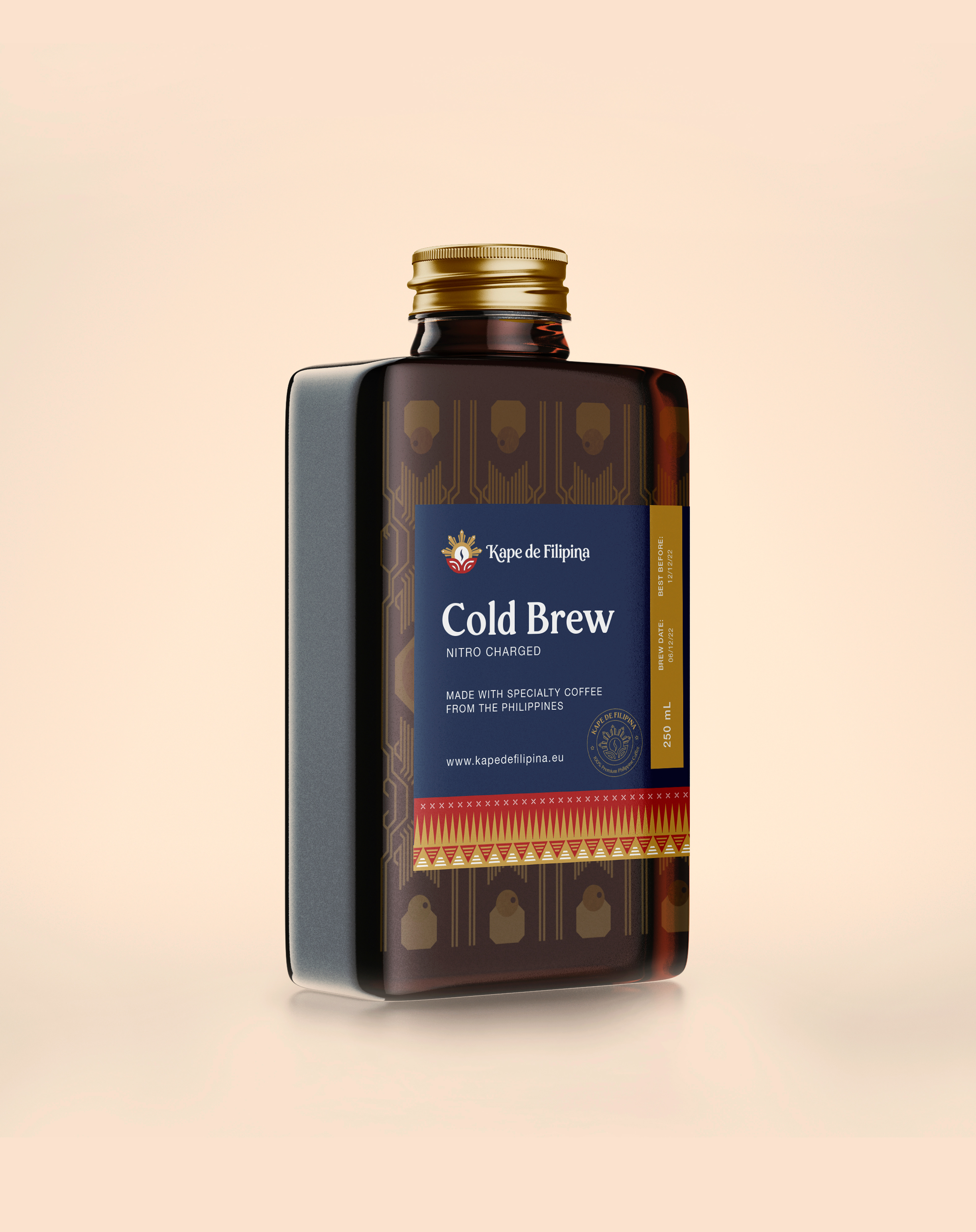
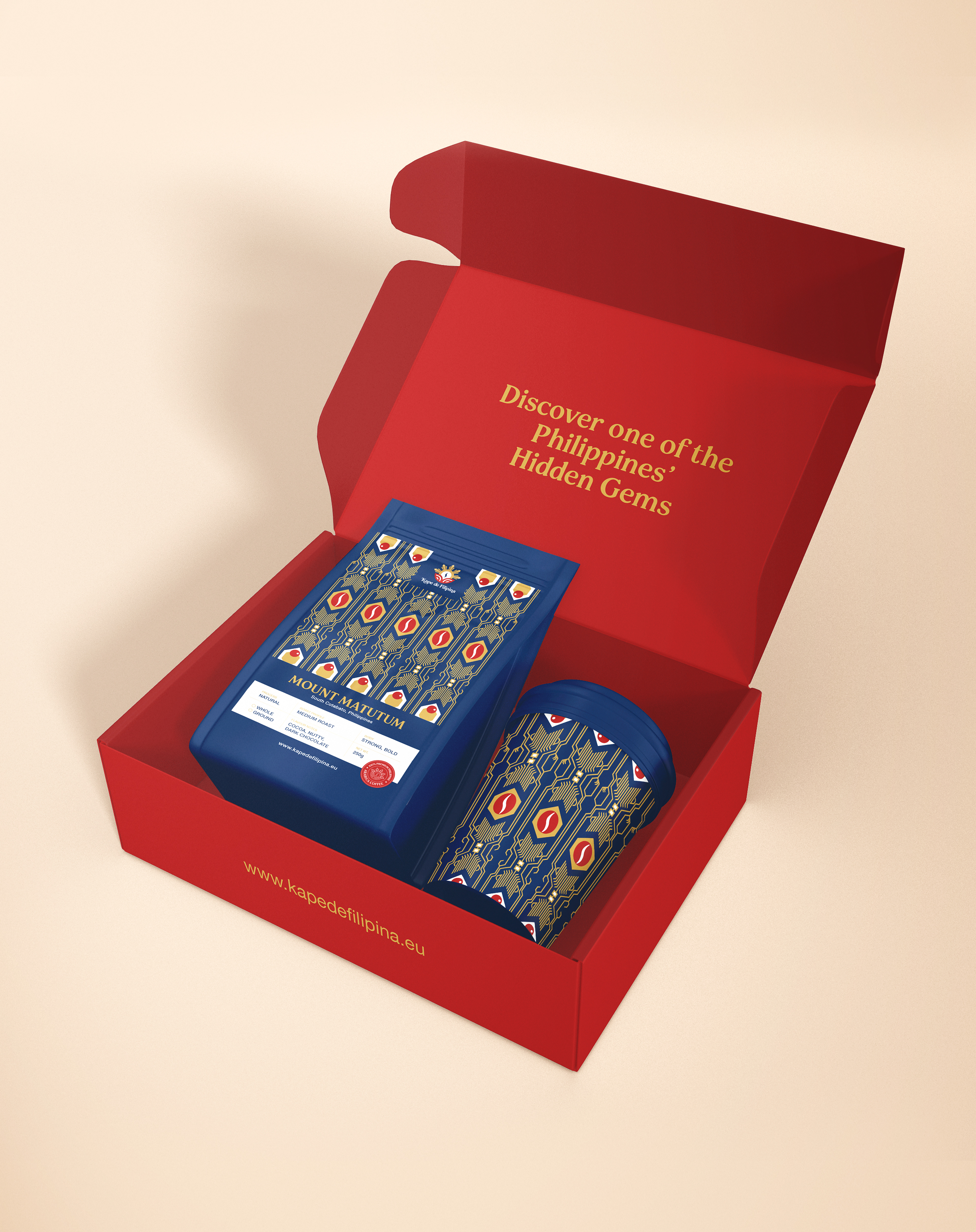
• Packaging Design
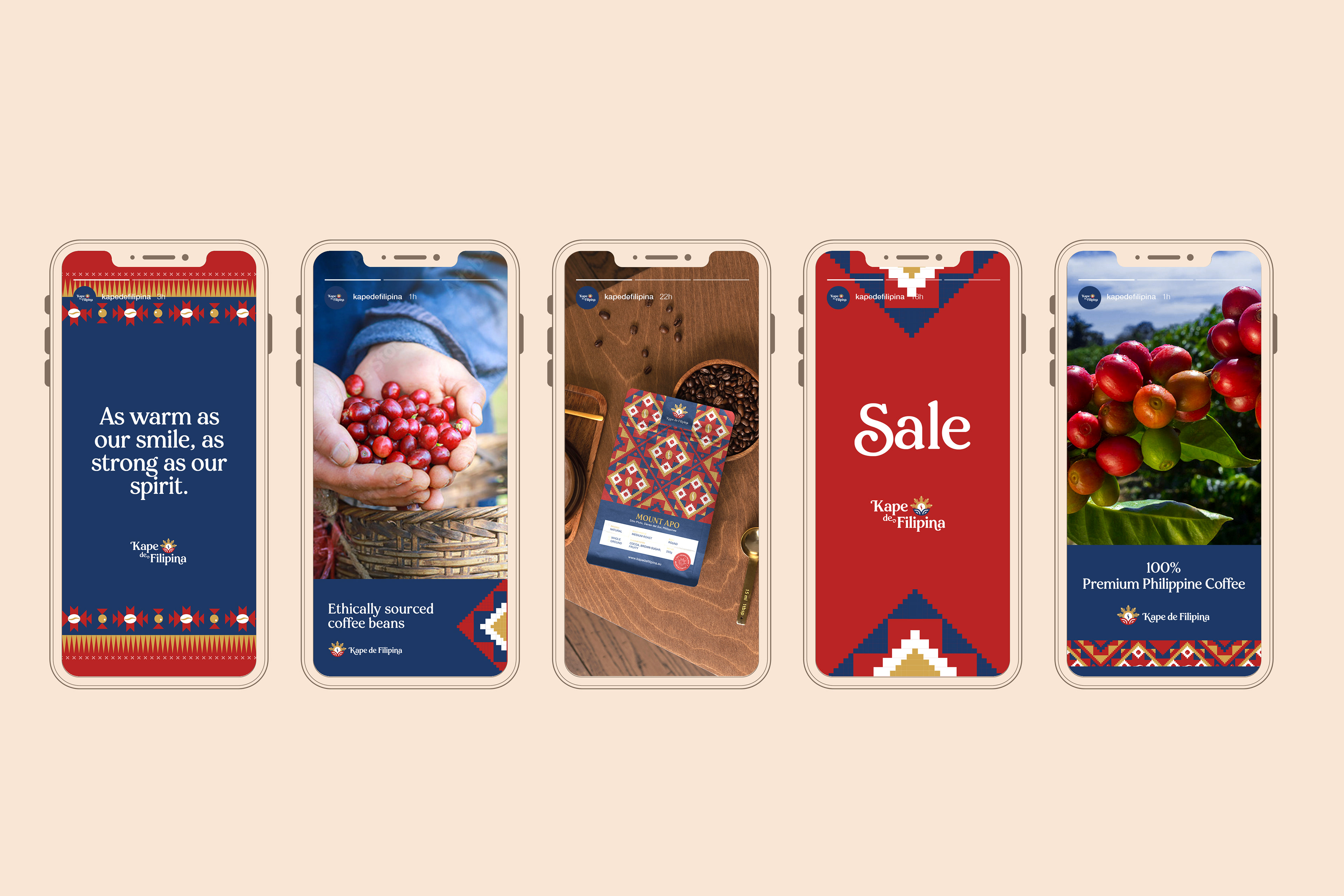
• Social Media Collateral
THE CHALLENGE
The task was to create a Brand Identity that will showcase the uniqueness of Philippine coffee, culture, and community, in a way that is relatable and warm for non-Filipinos to understand and appreciate.
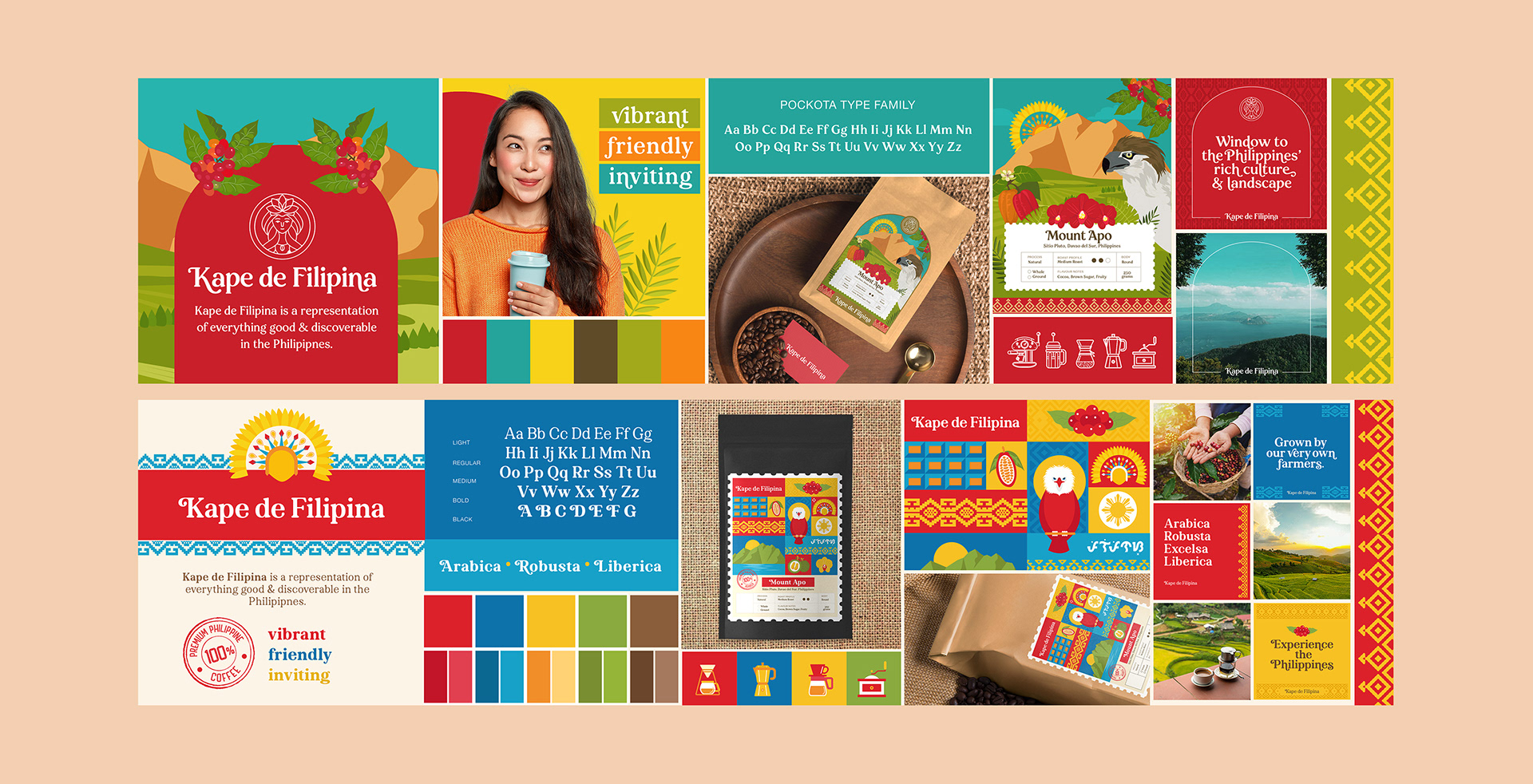
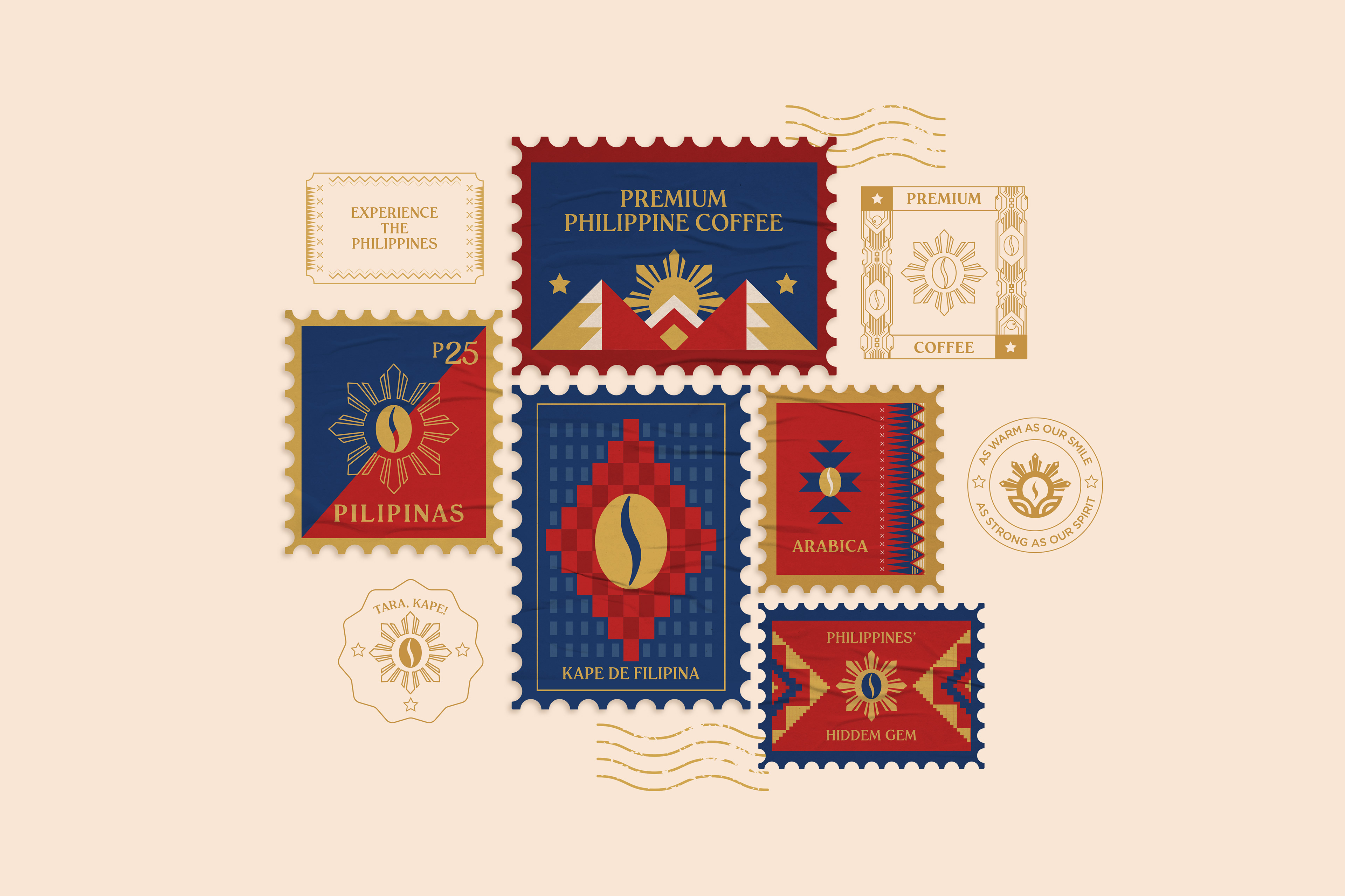
We explored different directions, and above are the first concepts that we presented to the client. In the first stylescape, we wanted to establish Kape de Filipina as a window to the Philippines' rich culture and landscape, hence the use of window elements. While in the second stylescape, we wanted the brand to feel like a letter or package from the Philippines, and therefore used stamp elements along with other Philippine cultural icons.
Initially, we wanted the brand to look colorful, vibrant, and friendly, much like the Filipino culture and the local coffee farmers. However, after a quick consumer test, we learned that the bright colours make the brand seem like a fruity tea brand, instead of coffee.
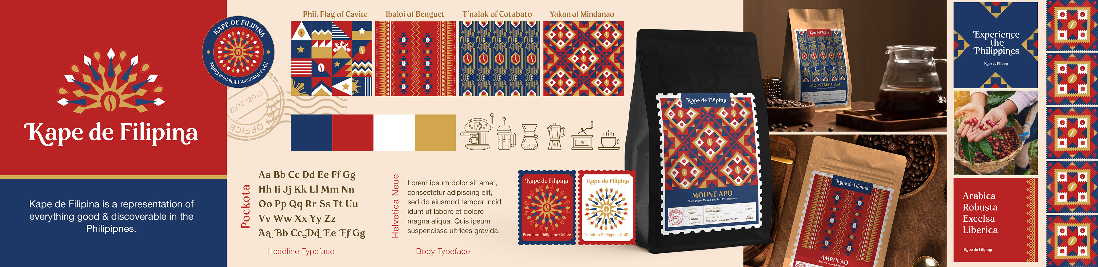
This led us to explore a different design direction that makes use of a darker palette and has indigenous patterns as visual key. The resulting look and feel positions Kape de Filipina as an inviting, authentic, down-to-earth, and premium but not alienatingly expensive brand; one that is heavily rooted in the Filipino culture, but is also appealing to foreign consumers.
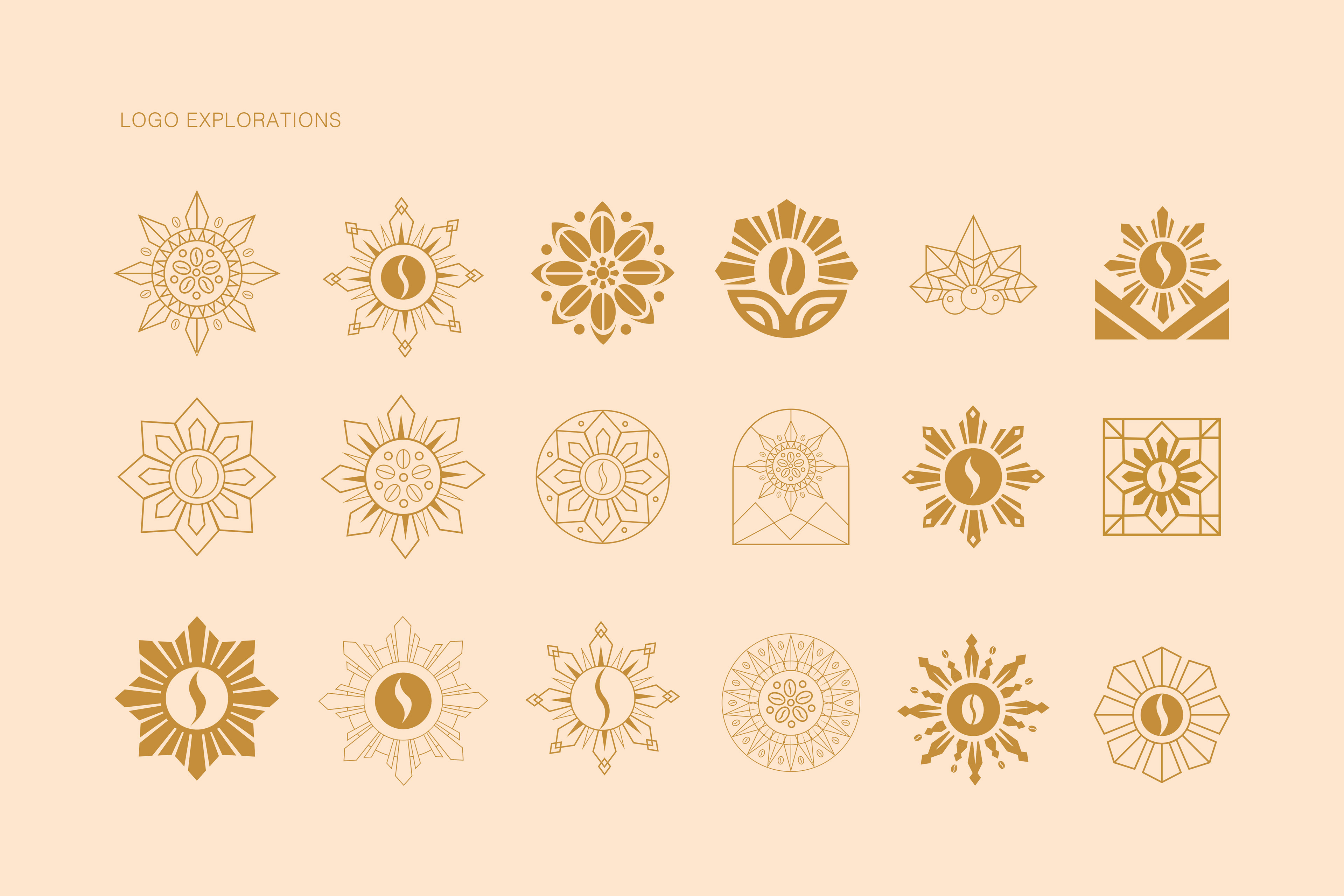
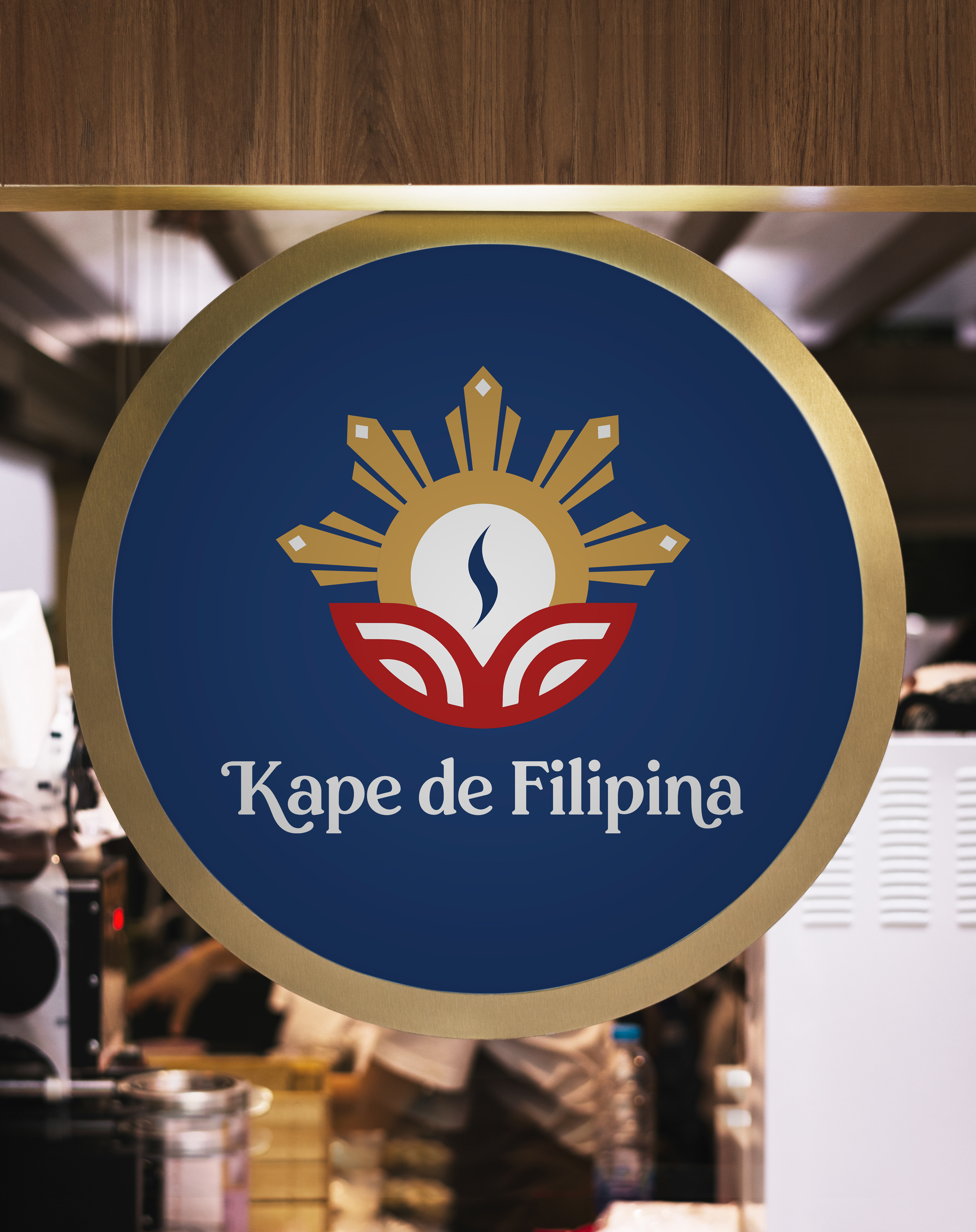
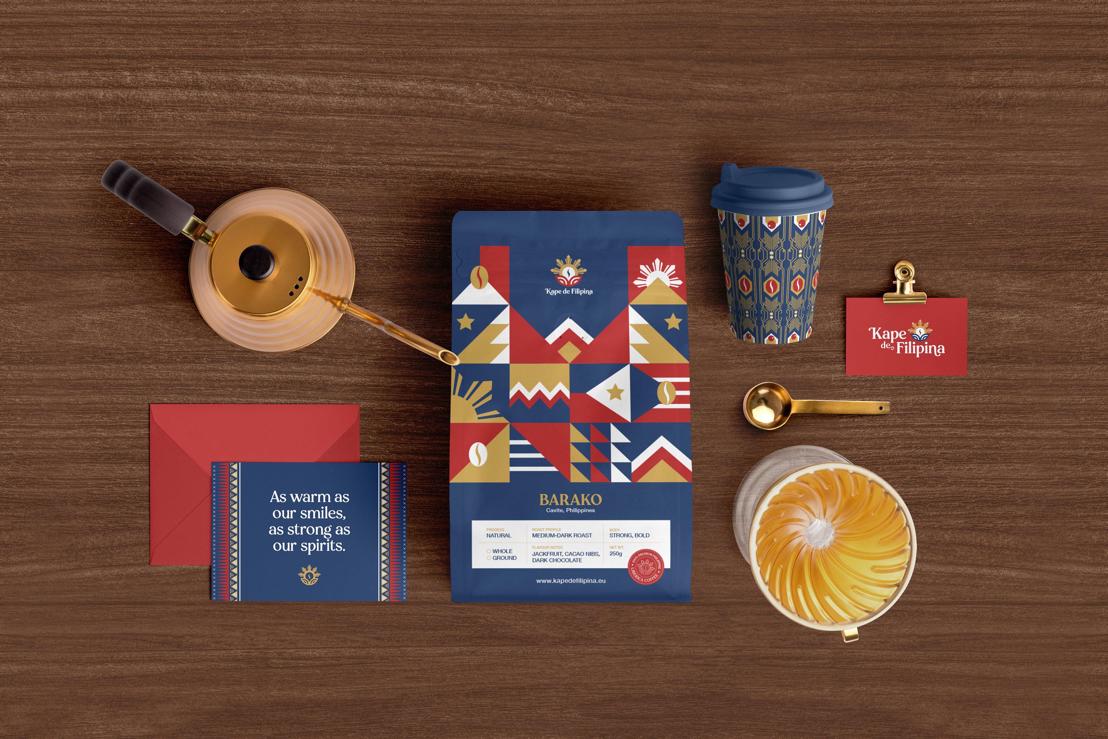
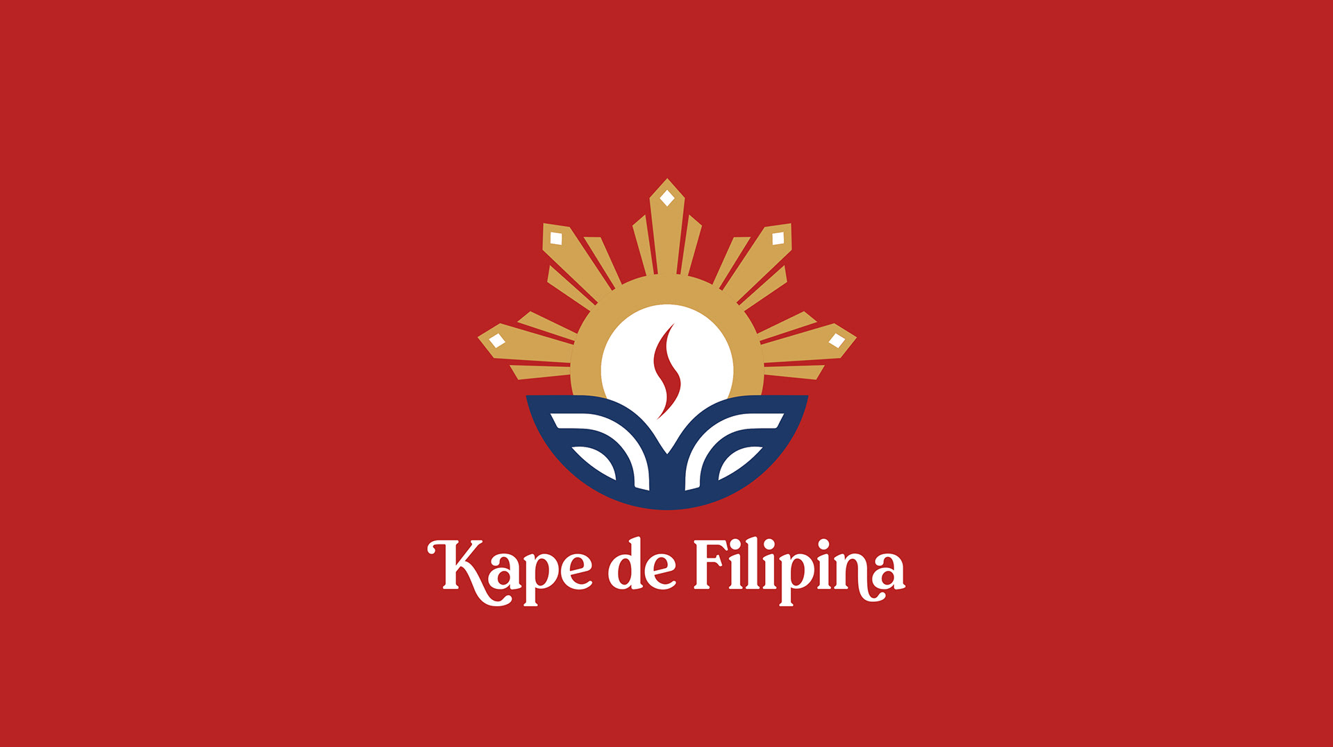
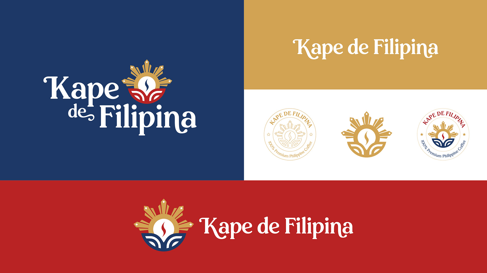
In order to match their brand name, we agreed that it was best to create a logo that directly conveys what they are - a Filipino coffee brand. We therefore used coffee bean and the golden sun of the Philippine flag as the main elements of the logo, and explored different variations of it over a period of few weeks.
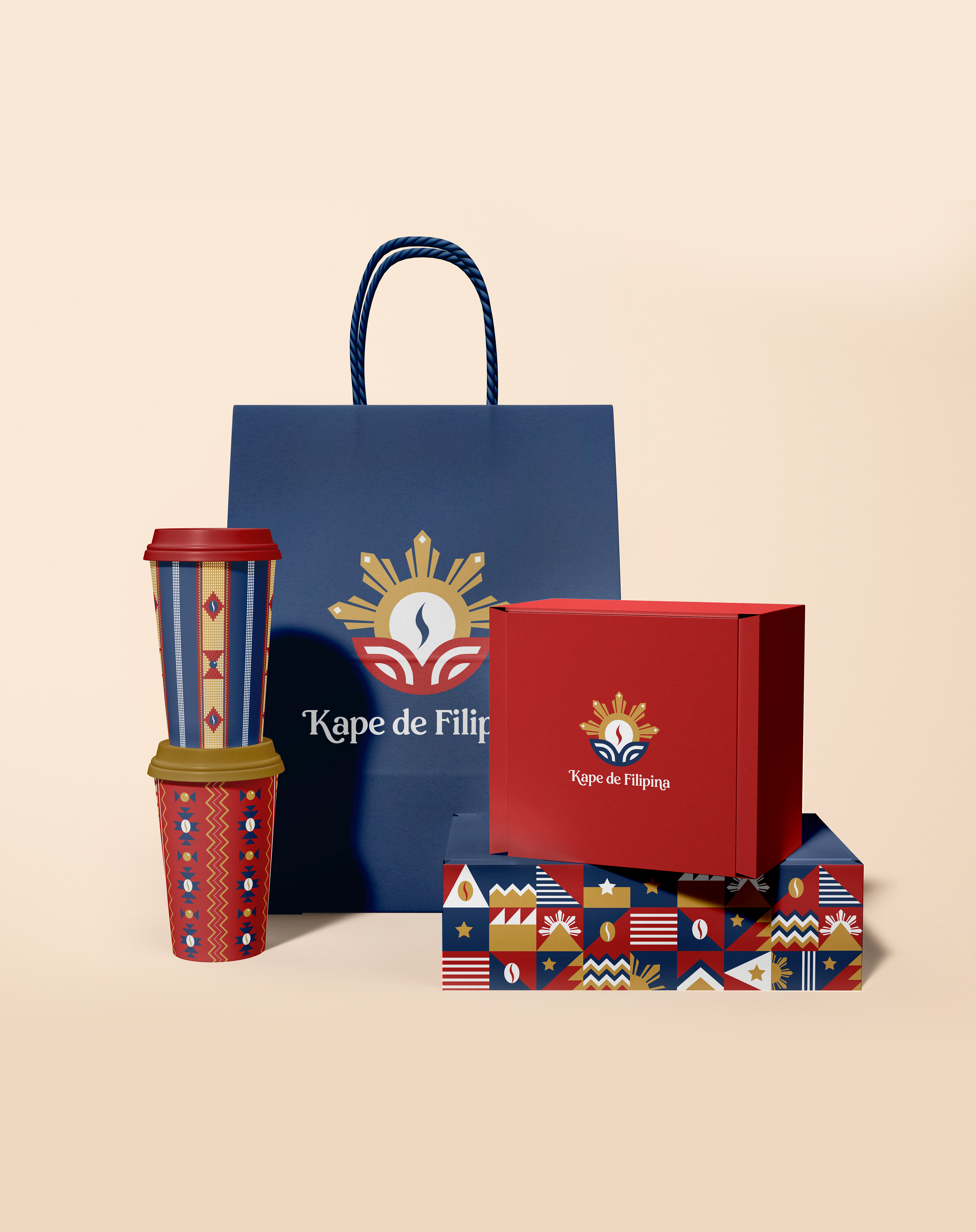
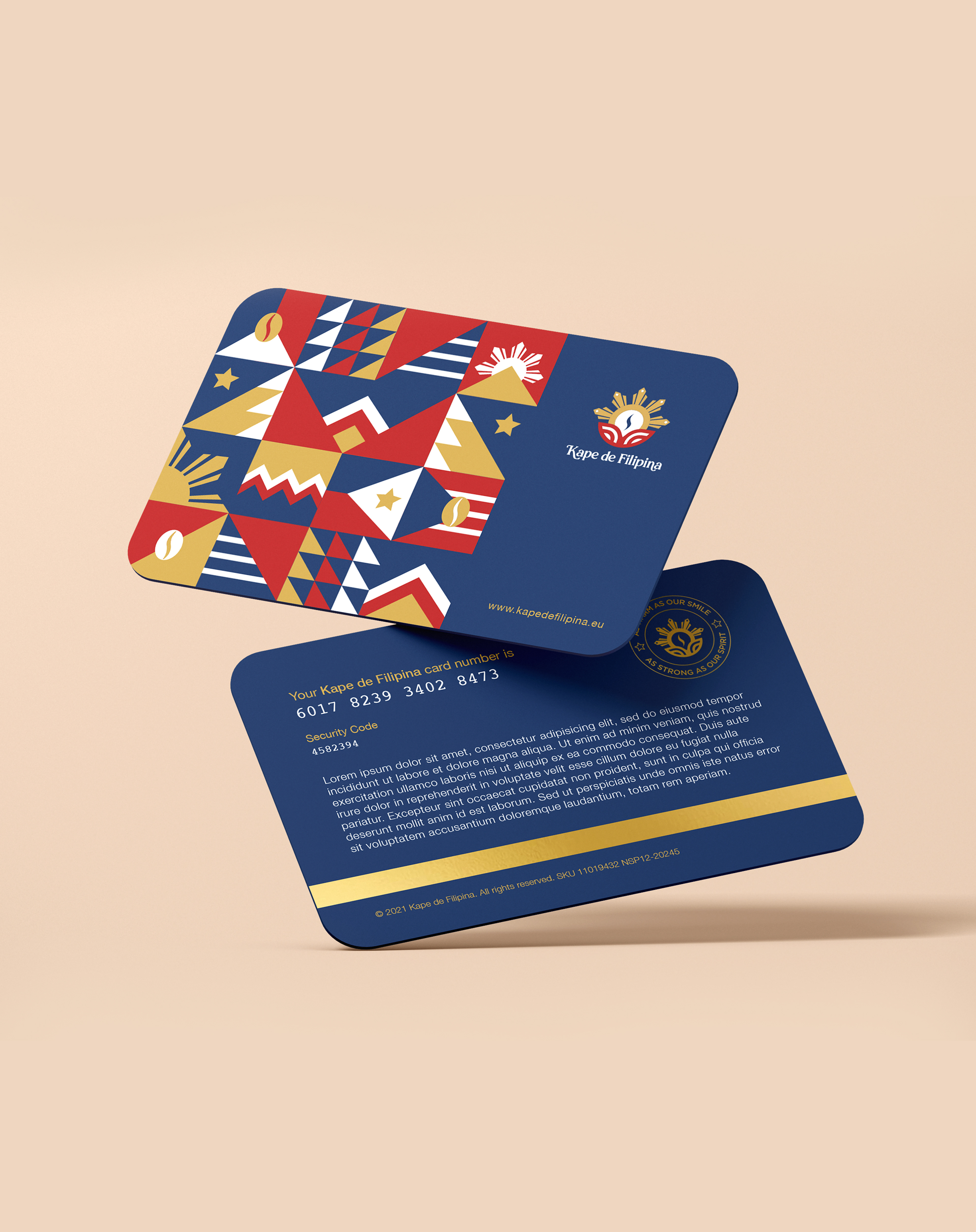
We have provided different logo lockups that should cover every space imaginable. Instead of trying to fit a logo into a space that is too small or crowded, we created different versions that the client can use for maximum visual impact and clarity.
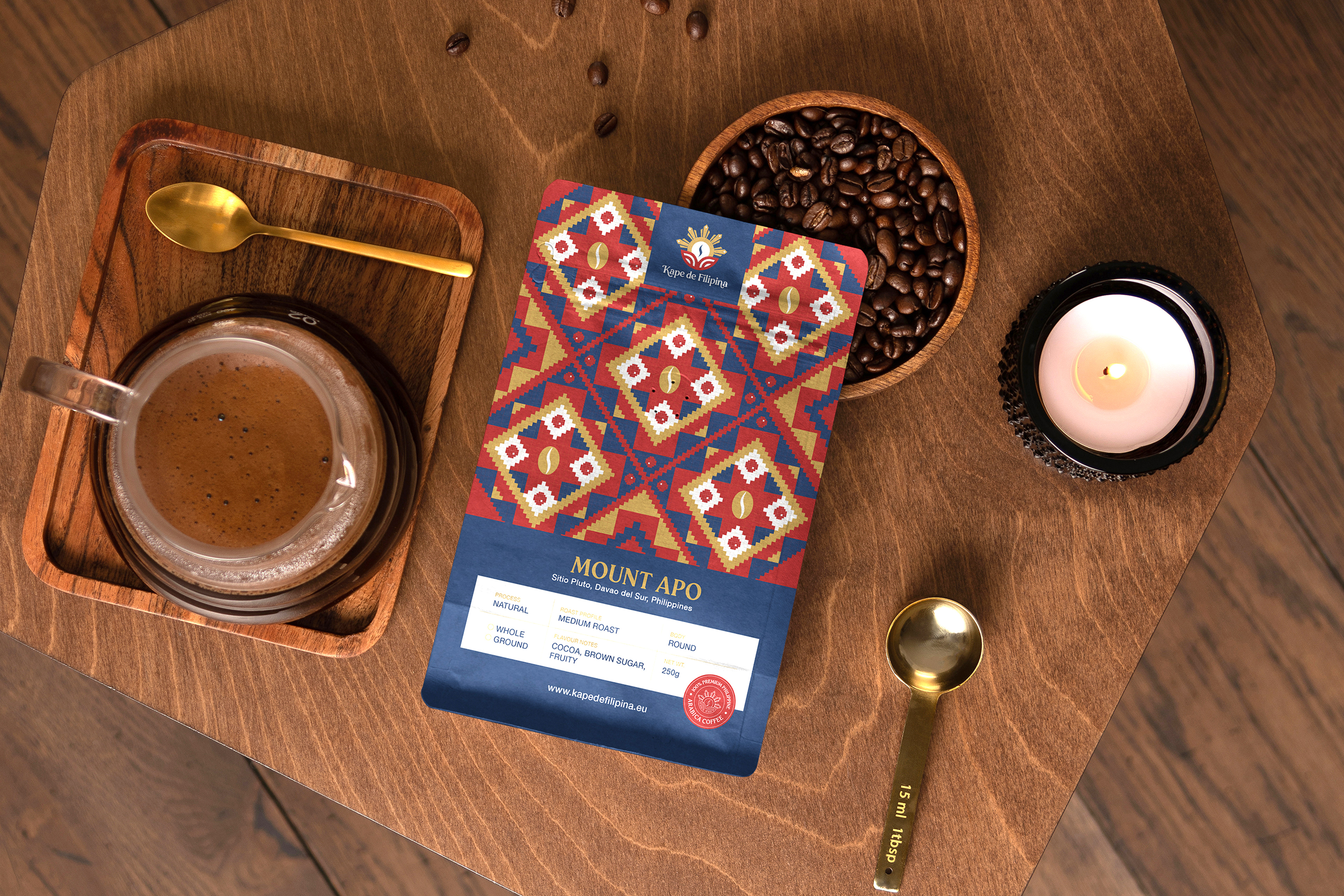
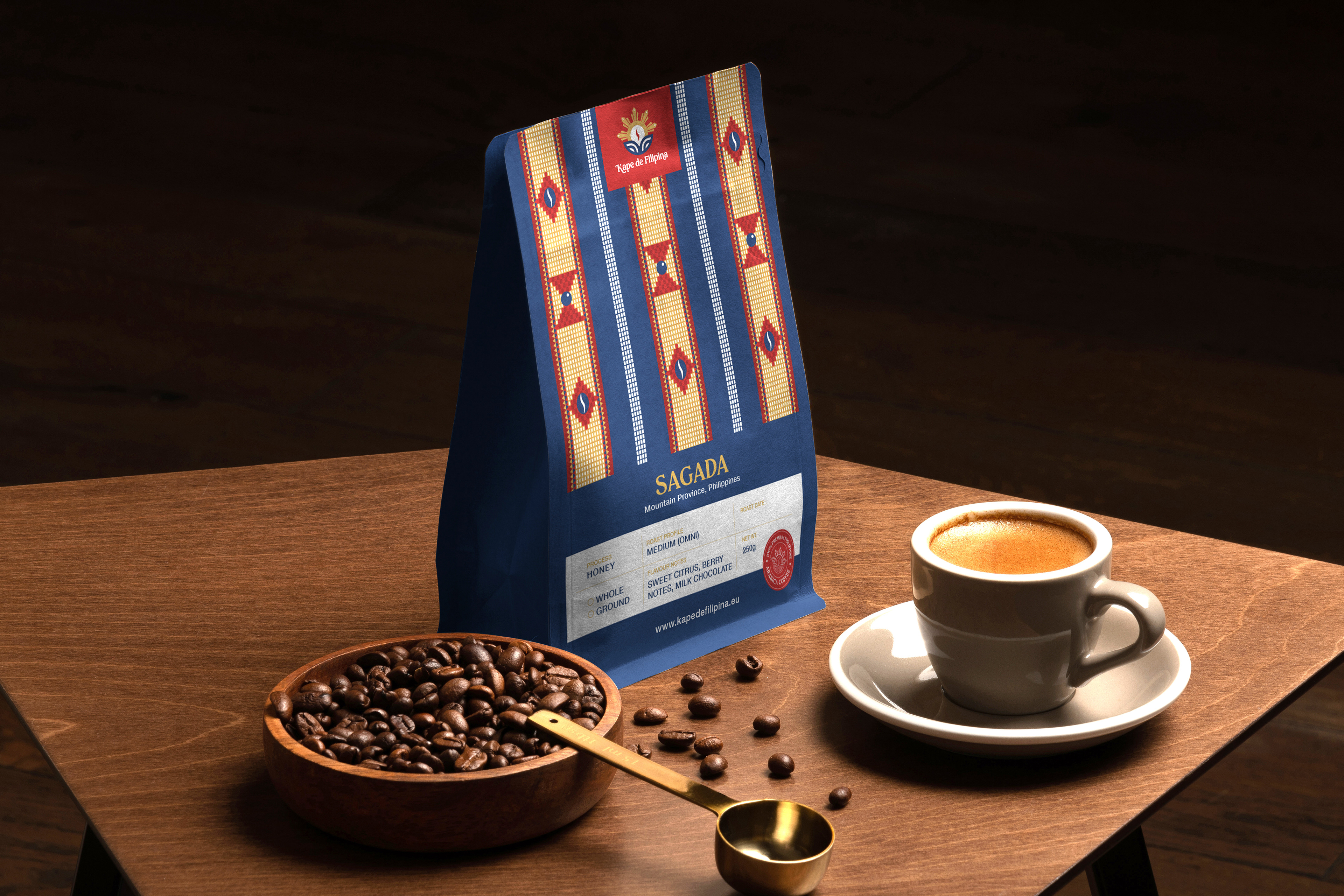
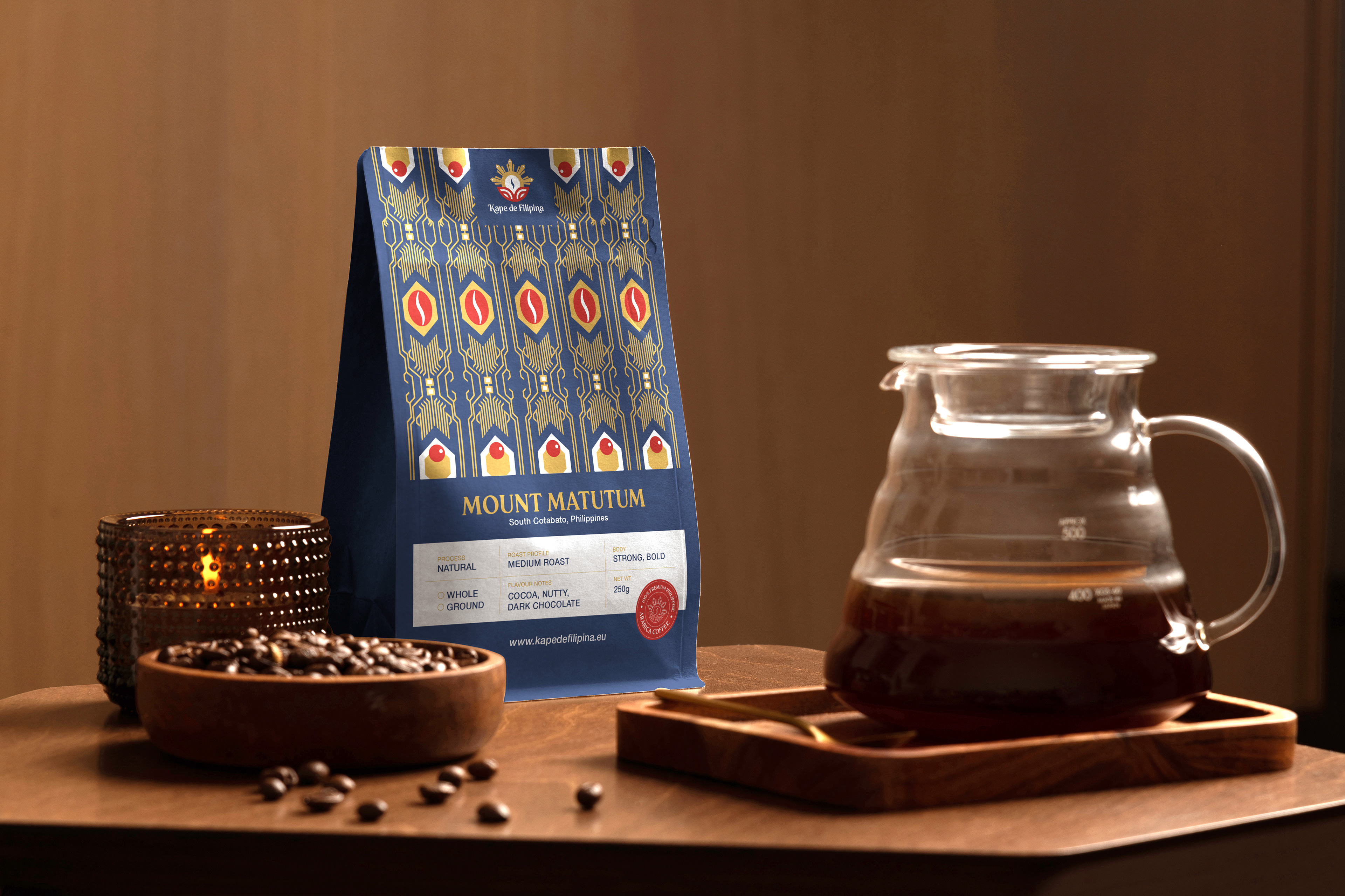
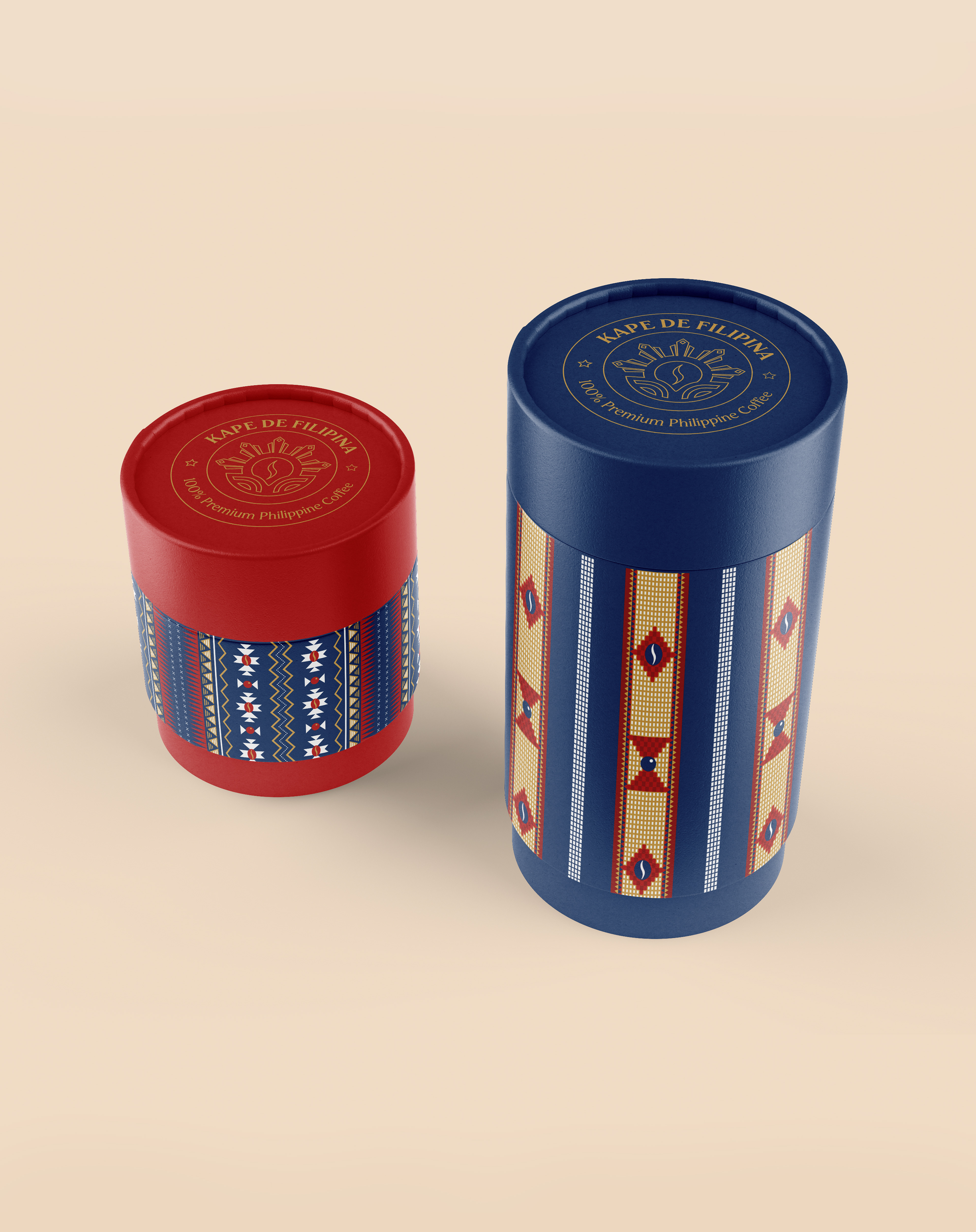
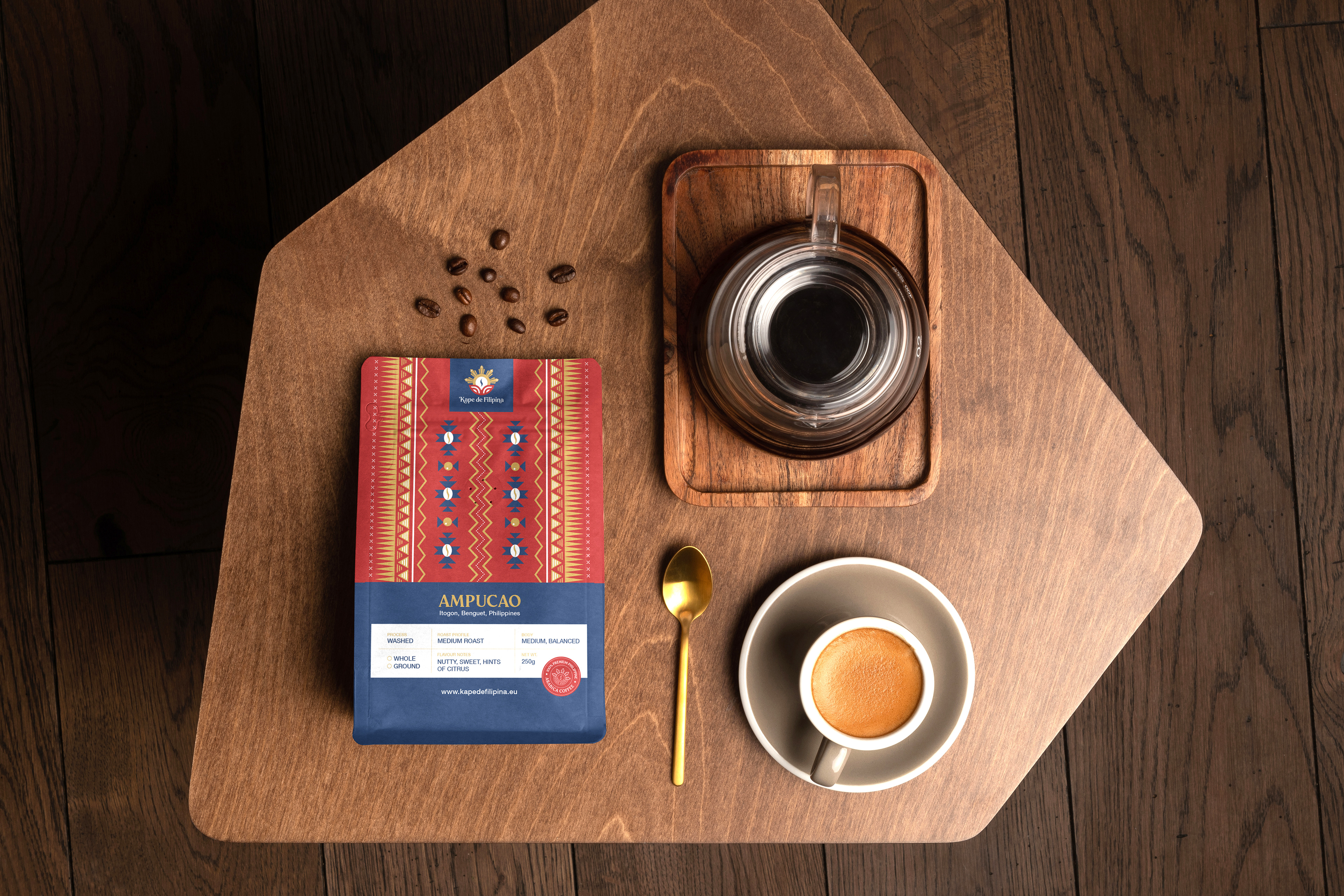
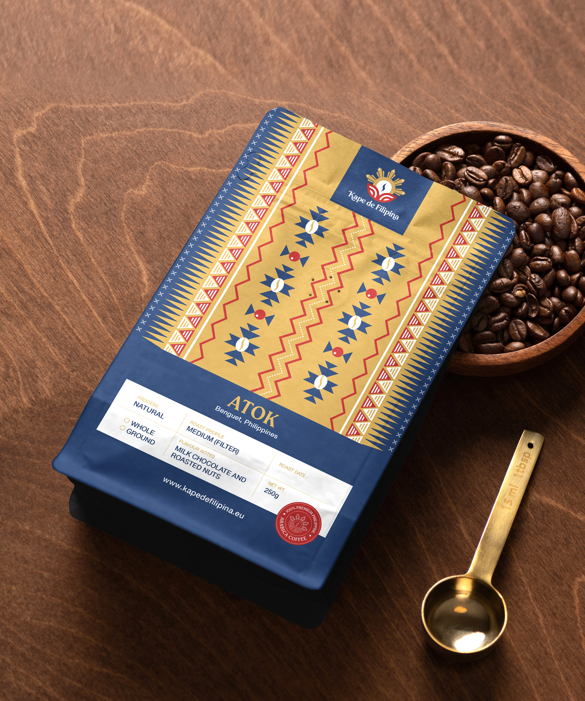
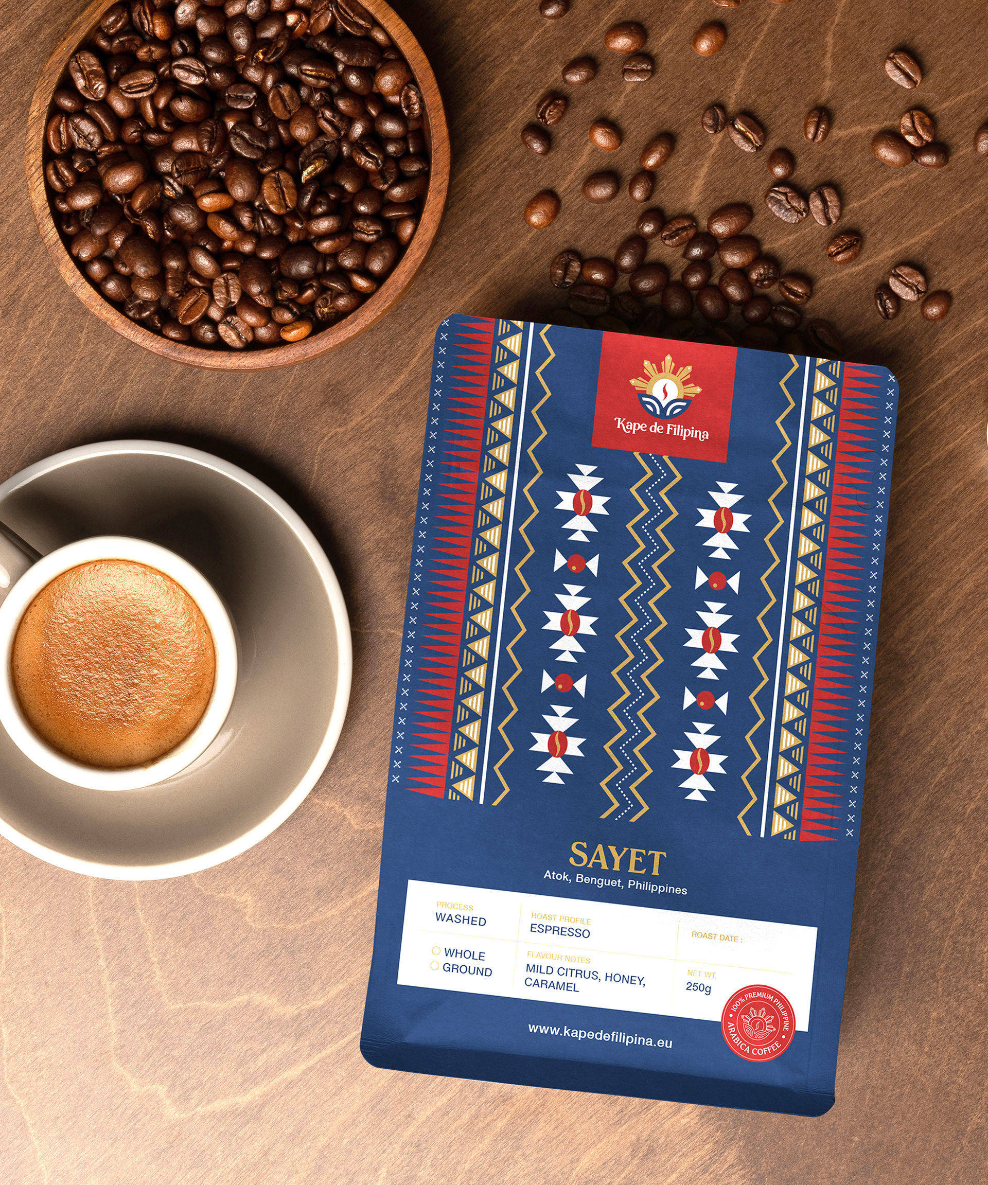
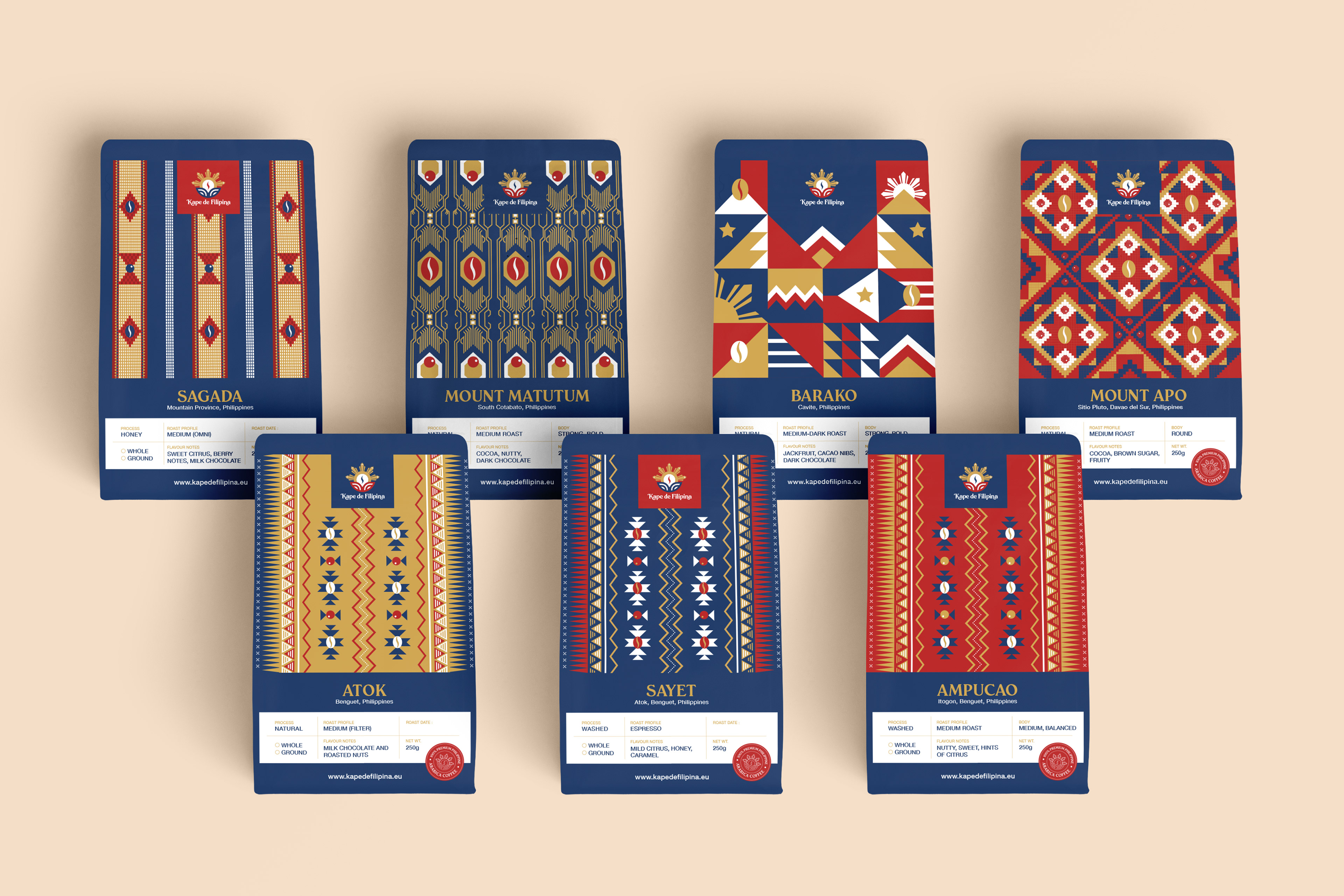
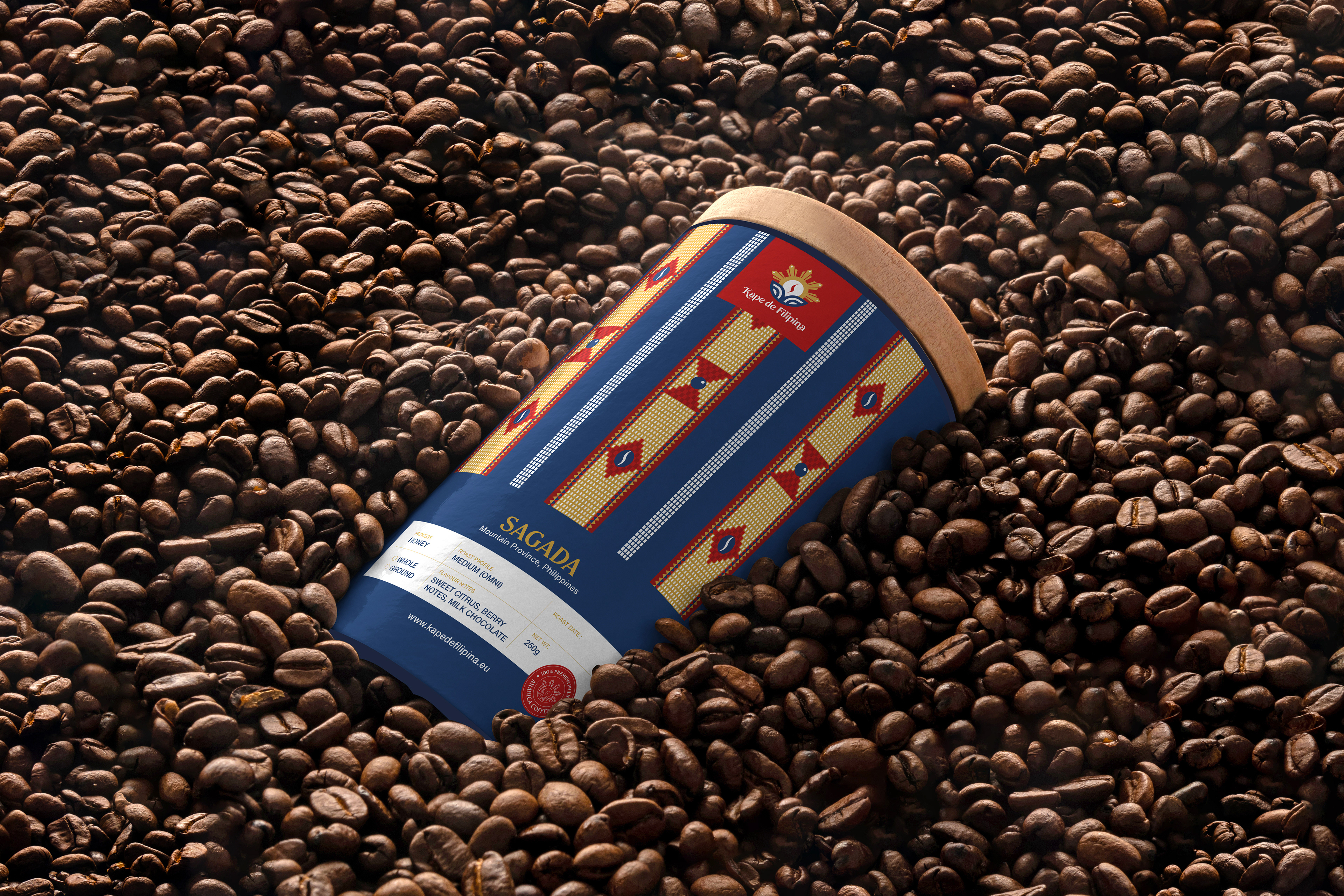
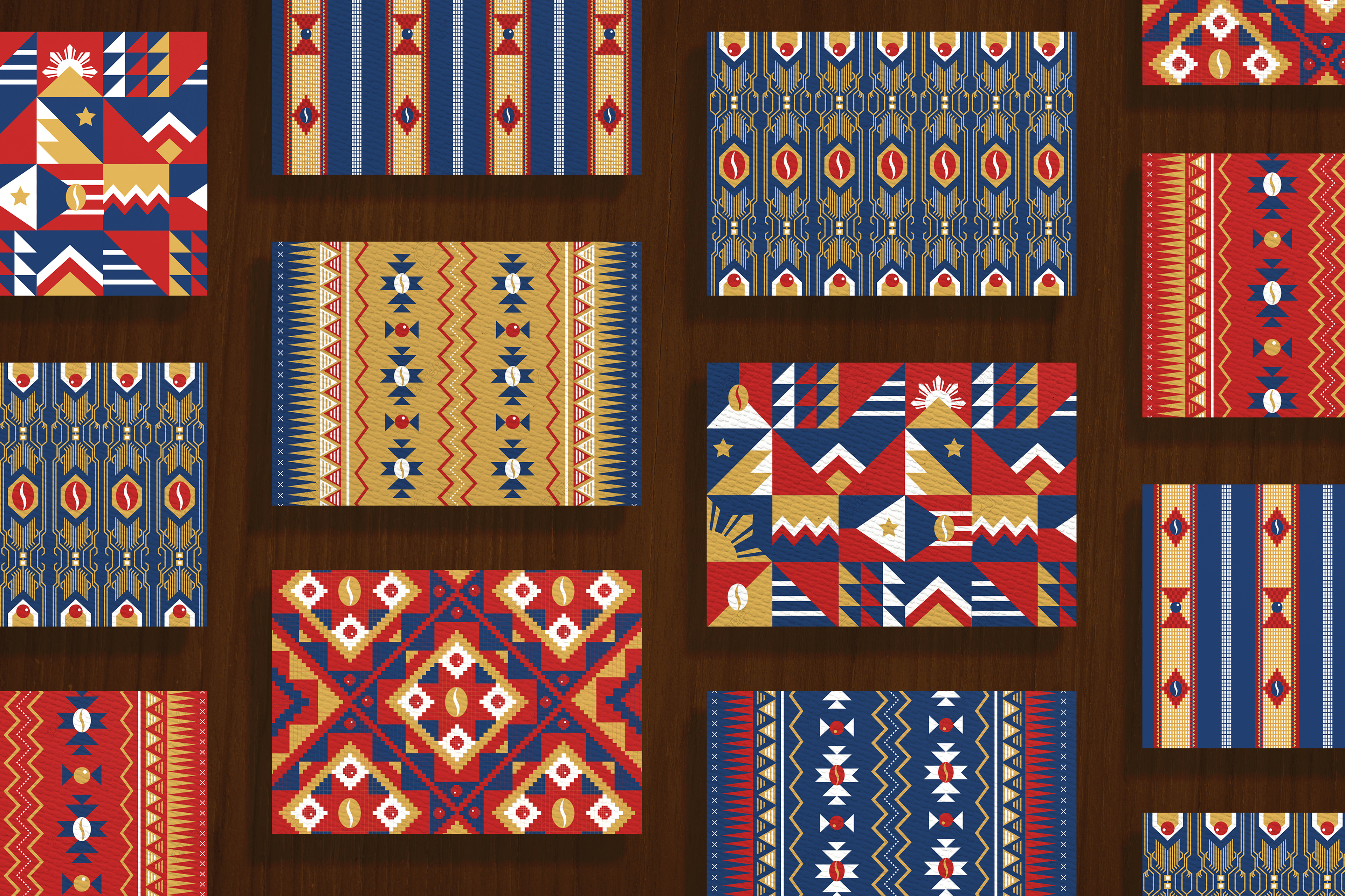
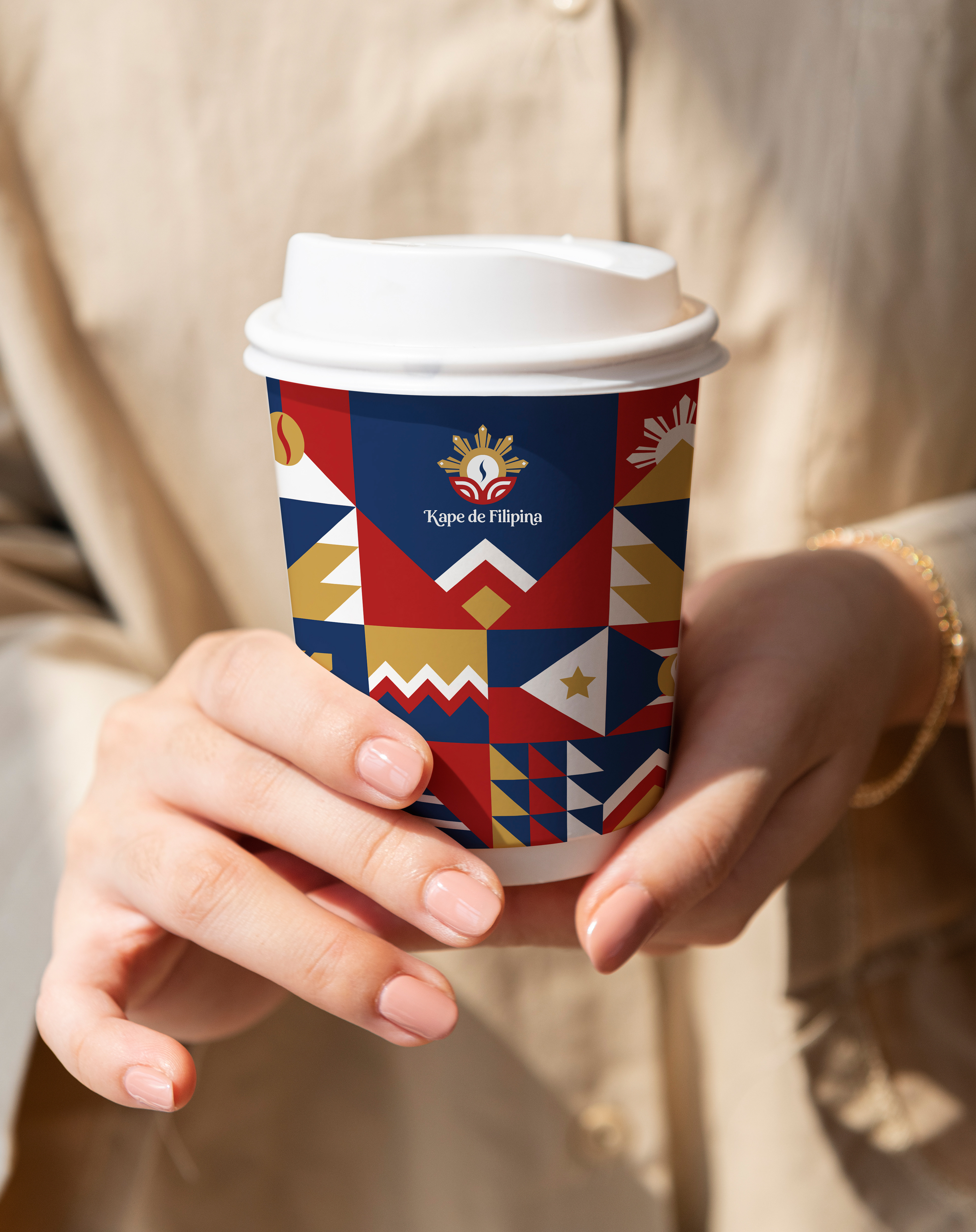
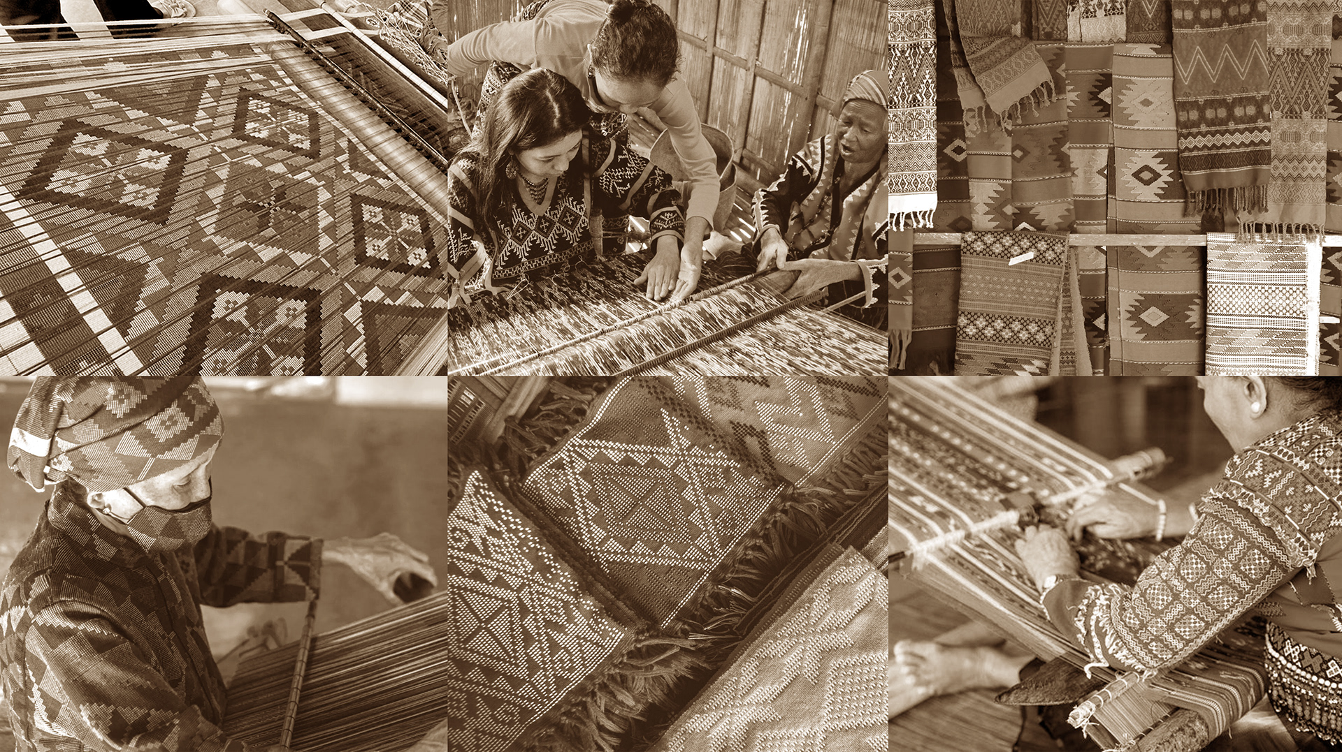
Major component of Kape de Filipina's Brand Identity System are the patterns inspired by the artistry of the local weavers from indigenous communities in the Philippines. Every weave tells a story that revolves around the culture of the local community, and is full of symbolic meanings that depict Filipino traditions and identity.
These patterns not only make the brand more interesting, they also make the system flexible enough to expand with the plethora of required applications.
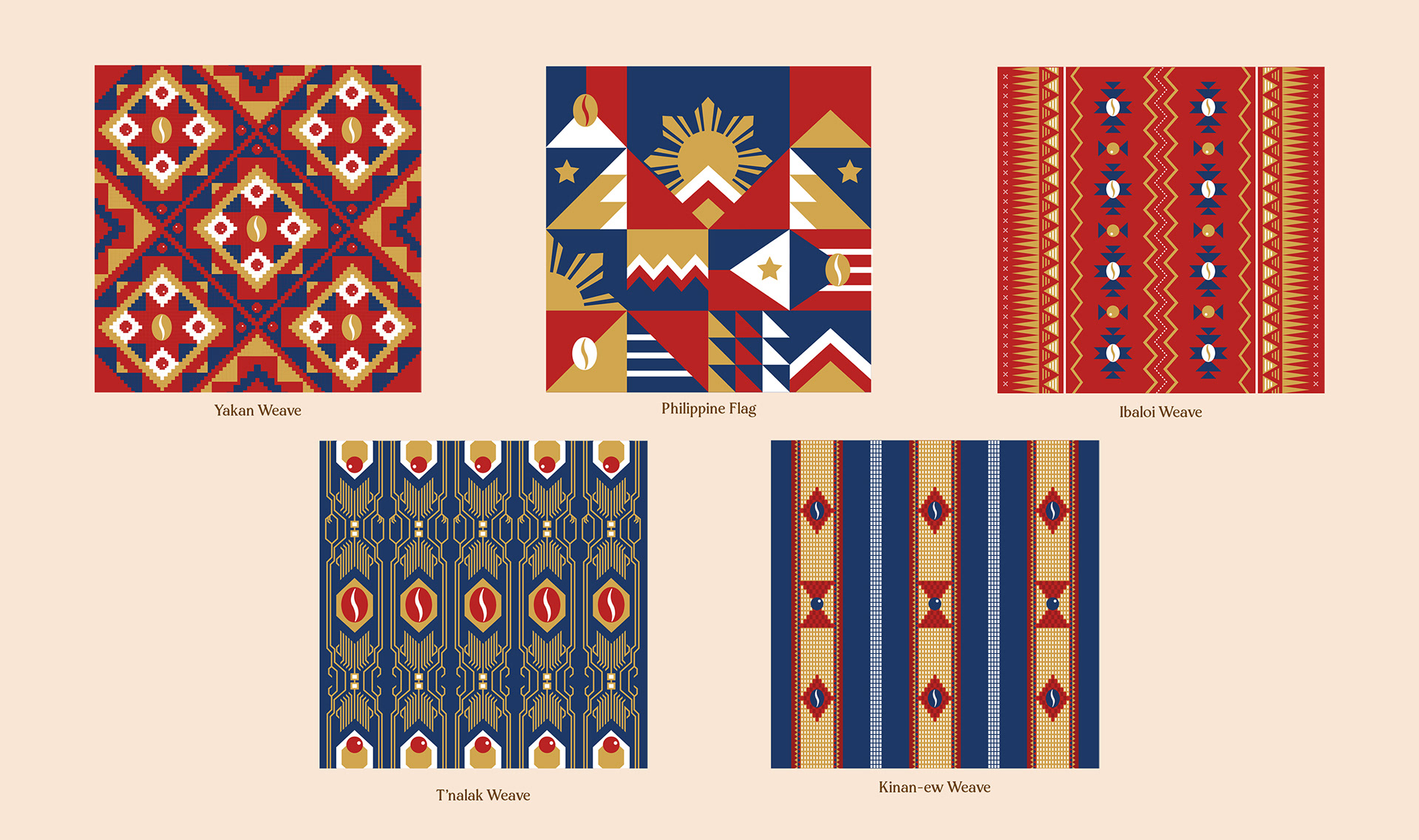
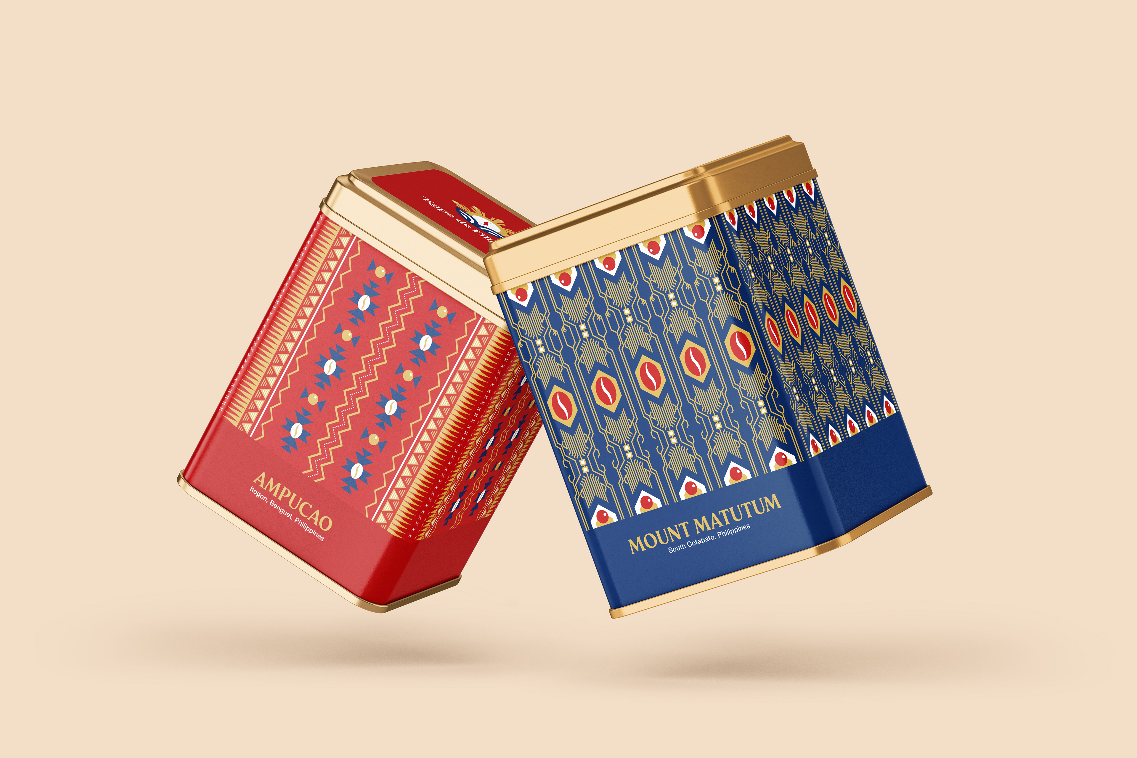
The whole strategy manifests itself in the product packaging. The pattern used for the packaging of each variant is specific to the coffee's origin and heritage - Yakan weave for Mount Apo, T'nalak weave for Mount Matutum, Kinan-ew weave for Sagada, and Ibaloi weave for Atok, Sayet, and Ampucao. For the Barako variety, we used the elements of the Philippine flag.